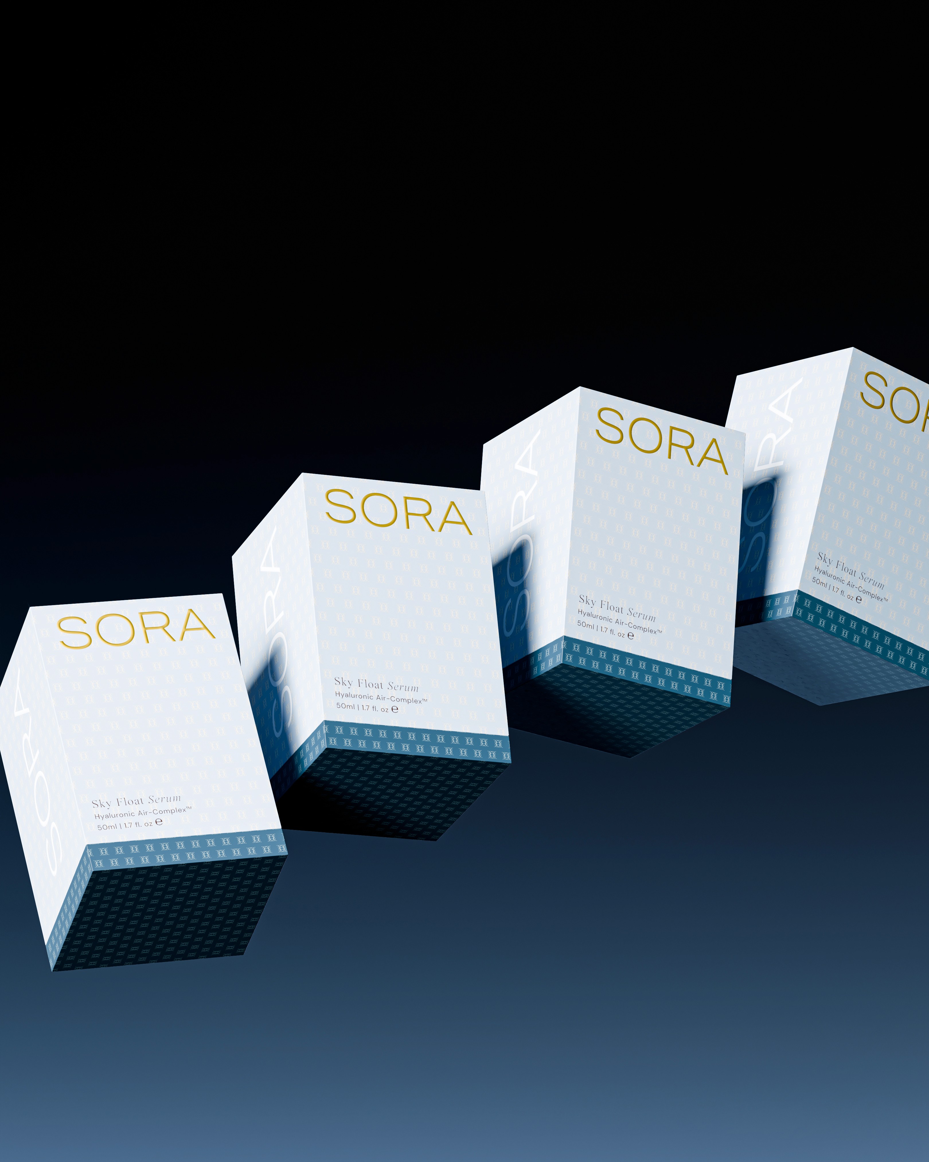

SORA
SORA (空) means sky in Japanese. The brand was born from the ethereal lightness of a balloon — a symbol of serenity, elevation, and effortless movement.
In a market saturated with heavy claims and cluttered aesthetics, the challenge was to create a skincare brand that feels like air — one that communicates efficacy not through density, but through lightness, calm, and elevation.
Every element of SORA’s identity expresses weightless transformation:
Textures so airy they barely touch the skin, yet transform it completely.
Formulas designed to be invisible yet deeply effective.
Packaging inspired by soft, rounded silhouettes and translucent materials that evoke clouds and air.
SORA redefines skincare as an experience of floating hydration, effortless glow, and breathable luxury — a ritual that lifts rather than layers.