How Print Aesthetics Are Defining The Next Era Of Beauty
By Ana Angulo

There’s a very specific shift happening in beauty packaging right now — one I’ve been watching closely across all the brands I develop, from luxury skincare to fragrance and even food-beauty crossovers.
We are entering the era of Editorial Packaging.
Not minimalist.
Not maximalist.
Not “clean girl.”
Not “clinical luxury.”
This trend sits at the intersection of magazine culture, high-fashion typography, and visual storytelling — creating packaging that feels like a printed object instead of a bottle.
And the reason it’s trending in 2025–2026 is bigger than aesthetic preference.
It’s rooted in psychology, culture, and consumer behavior.
Let me break it down.

Consumers are exhausted by sterile minimalism.
The “all-beige, all-sans-serif” look reached peak saturation between 2021–2024.
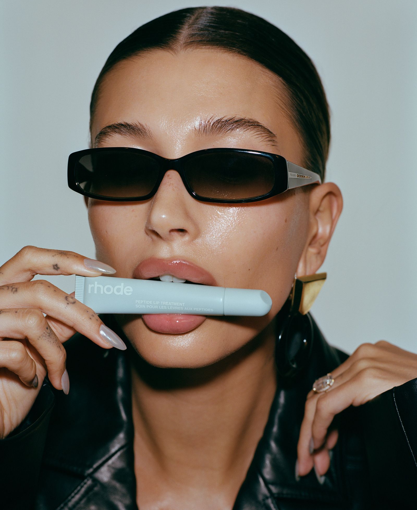
Brands like Glossier and Rhode perfected it — and as always, the moment something becomes mass, luxury shifts away.
According to a 2025 McKinsey report,
71% of Gen Z consumers say packaging feels “more premium” when the typography looks like a magazine layout.
Why?
Because editorial design signals craftsmanship, thought, human curation, and narrative — all things minimalism stripped away.


THE Print Aesthetic : WHAT DEFINES This LOOK?
If you're creating packaging with editorial energy, these elements show up again and again:
• Serif typography with personality
Not just any serif — fashion serifs, with contrast and rhythm.
Think: Harper’s Bazaar meets Loewe.
• High-contrast layouts
Margins, columns, headlines, justified text, micro-captions — all graphic devices borrowed from print design.
• Negative space used intentionally
Not emptiness — composition.
• The “cover” format
Products that look like a publication cover when viewed front-on.
Headline → Sub-headline → Hero statement.
• Layered storytelling
Instead of flat information, the packaging feels editorialized:
product name
tagline
date/edition
descriptive line
supporting text or micro-copy
It feels curated, not “designed.”
EXAMPLES OF editorial PACKAGING DONE well
1. Humanrace Skin by Pharrell (the updated capsules)
A masterclass in editorial spacing:
headlines treated like chapter titles
centered type that feels literary
product descriptions that read like excerpts
It’s modern but clearly inspired by print hierarchy.
2. Le Labo (always ahead of the curve)
This brand essentially invented the “lab editorial” space.
The typewriter label, the structured layout, the justified text — all very “newspaper chic.”
It’s clinical, yes, but the storytelling (location, date, perfumer) is pure magazine editorial.
3. FFORME Hand & Body Care
One of the best 2025 examples:
Ultra-fashion typography, dramatic spacing, almost book-cover design.
It feels like holding an art book in the shower.
4. Maison Margiela Replica Fragrance
Replica is literally editorial packaging:
a fabric label like a magazine pull quote
storytelling as front-facing copy
subheads like “Style Description”
Beauty brands rarely attempt this level of narrative clarity.
5. Aesop (the GOAT of typographic dominance)
Aesop has built an empire on typesetting as luxury.
Their newest product lines lean even more into editorial proportions and asymmetric layouts.

WHAT This MEANS FOR Your BRAND IN 2026
Editorial Packaging is not just a trend.
It’s a positioning strategy.
Here’s what it communicates instantly:
Your brand thinks deeply
Your product has narrative and substance
You are culturally literate
You speak the visual language of luxury fashion
You’re not trying to fit into “clean beauty minimalism” — you’ve evolved past it
For premium skincare brands, fragrance houses, prestige haircare, and wellness concepts, this is the aesthetic that separates “nice branding” from “luxury storytelling.”
WHY I BELIEVE THIS Trend HAS LONGEVITY
I always ask myself:
Is this trend simply visual, or is it psychological?
Editorial packaging is psychological.
It taps into nostalgia, tactility, narrative, and craftsmanship — elements humans are wired to respond to.
Consumers don't just want “pretty products” anymore.
They want packaging that feels intelligent, intentional, cultured, and collectible.
That's exactly what Editorial Packaging delivers.
And that’s why I believe this trend will define luxury beauty through 2026 and beyond.
Photos By:
Salt & Stone
Le Labo
Blank Space Studio