Why Packaging Now Has to Perform Like Interior Decor
By Ana Angulo, Packaging Expert

Why Shelf-First Design Has Become Essential
There’s a shift happening in beauty that’s bigger than trends, formulas, or even ingredients.
It’s happening on bathroom shelves, vanity trays, bedside tables — the intimate spaces where beauty lives.
We’ve officially entered the era of Shelf-First Design.
Beauty packaging is no longer designed only to protect a product or communicate functionality.
Today, it must perform as a decor object, a styling piece, and a micro-interior design element in the home.
This is one of the most important packaging shifts of 2025–2026 — and it changes everything about how brands must design today.


The Rise of the “Shelfie Economy”
Platforms like TikTok, Pinterest, and Instagram have transformed shelves into sets.
Consumers now stage products:
color-matching skincare
arranging bottles by height
styling products like candles and ceramics
photographing textures and bottles in natural light
And here’s the data:
58% of Gen Z say packaging aesthetics influence whether they repurchase a product.
71% of young consumers display beauty products as decor, not storage items.
Packaging has become part of the home environment — and that has changed consumer expectations.
The Business Impact of Shelf-First Packaging
This trend isn’t just aesthetic — it’s financially powerful.
Higher Retention
Products kept on shelves = used more often = repurchased sooner.
Higher Social Shareability
Shelfie-friendly packaging gets shared organically.
Free marketing, every single day.
Higher Perceived Value
Beautiful packaging justifies premium pricing without additional formula upgrades.
Higher Brand Memory
A consistent, decor-worthy look becomes instantly recognizable.
Beauty as a Lifestyle Category
Beauty is no longer:
what you wear
what you apply
what you buy
It’s how you live.
Brands like Aesop, Le Labo, and Rhode didn’t just build products — they built worlds, color palettes, object language, and interior moods.
A product now has to look like it belongs in:
a minimalist European apartment
a warm Japandi bathroom
a Mediterranean vanity with stone textures
a neutral modern home with soft light
This connection between interiors and packaging is shaping design decisions more than ever.

What Shelf-First Design Actually Looks Like
This trend isn’t random aesthetic preferences — it’s a design system.
Here’s what defines true shelf-first packaging:
Harmonized Color Systems
Products must visually “flow” together on a shelf.
This is why brands like Rhode and Salt & Stone avoid chaotic color coding.
Sculptural Object Forms
Rounded jars, architectural bottles, carved caps — bottles that feel like decor pieces.
Examples:
Aesop’s amber apothecary bottles
Byredo’s orb-shaped fragrance caps
Soft, Elevated Finishes
Matte, frosted, brushed metal, textured resin — finishes that photograph beautifully in natural light.
Proportion + Height Play
Packaging must look good as an ensemble — products need deliberate variation in:
height
volume
silhouette
This is how interior designers build shelf compositions.
Brands Doing Shelf-First Design Perfectly
1. Aesop
Soft amber bottles, uniform silhouettes, minimal labels.
Every product looks harmonious in a bathroom setting.
2. Le Labo
Industrial-luxury typography + neutral tones.
Fits every interior style while maintaining distinctiveness.
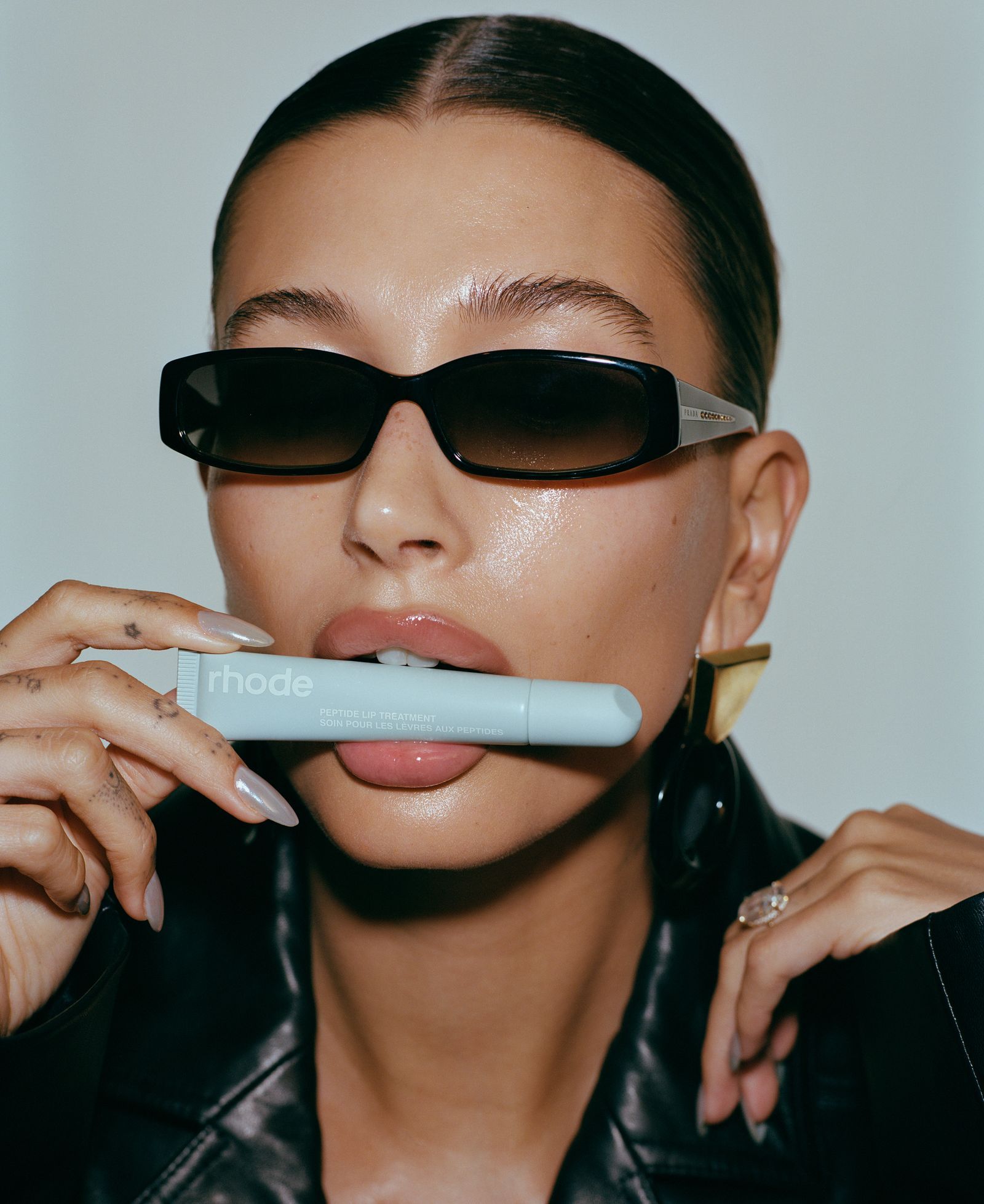
3. Rhode
Shelf-perfect color palette: greige, neutrals, soft mattes.
Designed specifically for “bathroom aesthetic photos.”
4. RANAVAT
Royal tones, elegant proportions, and polished finishes that blend into luxury interiors.